|
OPTICAL ACUMEN At the Intersection of Data Visualization and Investment Research |
|||
|
Sunday, August 31, 2014 Introducing the Portfolio StackThe August/September issue of Morningstar Magazine includes an article on the Portfolio Stack, my new concept for analyzing portfolios. You can see the full article here or use this link to download a PDF of the magazine issue, but this blog post provides some additional background and explanation of the concept. (Thanks to Morningstar designer Zach Sherwood for his excellent work on the article. He refined -- and improved -- my original concept sketches. The images below are from the article.) The Portfolio Stack was inspired by the classic population pyramid graphic, which has been in use since the mid-19th century. It uses horizontal rows to divide the population of a region or country into age groups, with each row split by gender to provide an instant analysis of the age and gender distribution of a population. The following example appeared in the Statistical Atlas of the United States that was created using the 1870 census data: 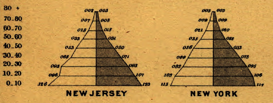
The Portfolio Stack applies the same idea to portfolios of managed investment products or indexes, with rows based on industry sectors. The width of each row is proportional to weight of the sector in the index or portfolio, with the market's largest sector (by market capitalization) on the bottom and the smallest sector on top. Hence, large sector deviations from the market become obvious and a visual metaphor of decreased stability (and correlation) relative to the market emerges. (This would work without centering the bars, but the rationale for doing so will soon be apparent.) Here's what the stack looks like for the Morningstar Broad Market Index: 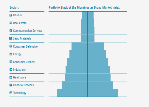
The shape of the stack for BBH Core Select BBTEX, a relatively concentrated mutual fund with no utilities or real estate holdings and minimal exposure to industrials, is quite different: 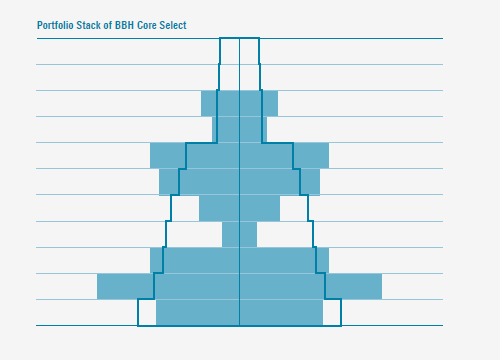
Beyond basic sector exposure, more details emerge when the sector bars are chopped into blocks, proportional to the weight of each holding within a sector. While the population pyramid uses a vertical line to divide each row by gender, a line can be used in the Portfolio Stack to divide and order each row based on the performance of each stock held in the portfolio. This performance view of the stack places stocks with negative returns on the left and those with positive returns on the right, with a color scale that reflects the magnitude of loss or gain. The result is an image that quickly reveals how the fund's picks in each sector performed relative to each other and how different stocks and sectors contributed to the portfolio's overall performance. Here's a stack based on the one-month performance of BBH Core Select: 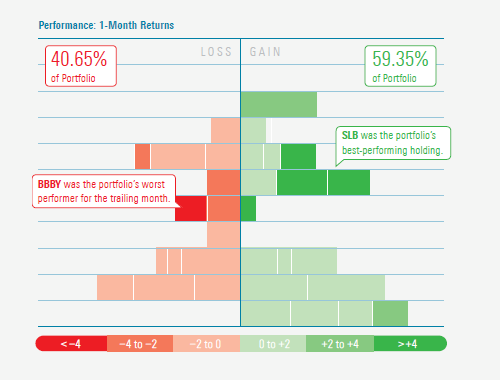
The stocks within each row can also be ordered and colored using other measures. Here's a valuation version of the stack, where the color of each company is based on its current stock price divided by a Morningstar analyst's estimate of the Fair Value of each share. Stocks with a ratio of less than 1.00 are considered undervalued, and those with a ratio of more than 1.00 are deemed overvalued: 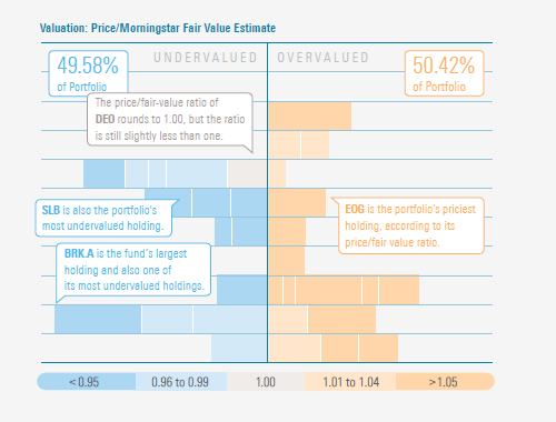
An interactive version of the Portfolio Stack, which would allow you to hover over each segment to identify the stock and view additional information, would be an ideal extension of the concept. Yet even as a static image -- or reduced to a simple outline -- the stack can still provide meaningful insight into the portfolio of an index or managed investment product. Follow @davidharrell Tweet 
|
Throughout my career at Morningstar, the Chicago-based investment research firm, I've used creative language and visual elements to explain complex investment information and ideas. This is a personal site--all opinions expressed here are my own.
Contact David Harrell personal website Links Graphic Detail EagerEyes FILWD Morningstar Magazine's Chart Tumblr Spurious Correlations Statpics Storytelling with Data Visual Complexity Recent Posts A Ten-Year Performance Current Visualizing an Investment Watchlist Clocking 2016 Investment Performance Another Year on the Clock Stacking Two Market Corrections Histogram Jam Investment Performance Currents Mapping Investment Portfolios and Indexes Clocking Investment Performance Charting an Investment Portfolio by Holding Time Archives June 2014 July 2014 August 2014 November 2014 February 2015 April 2015 January 2016 February 2016 March 2016 January 2017 March 2017 July 2017 |