|
Thursday, November 13, 2014
Charting an Investment Portfolio by Holding Time
The current issue of Morningstar Magazine includes my short article on visualizing portfolio holdings, based on the amount of time held. You can see the full article here or use this link to download a PDF of the magazine issue. (Thanks once again to designer Zach Sherwood for his work on the graphic.)
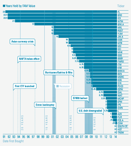
The portfolio turnover calculation has long been used to quantify the trading activity of a portfolio manager. But it doesn't reveal how long individual holdings have remained in a portfolio.
Here's what one concentrated mutual fund (FAM Value FAMVX) looks like when the holding period for each current holding is plotted as a horizontal bar:

|
|
Throughout my career at Morningstar, the Chicago-based investment research firm, I've used creative language and visual elements to explain complex investment information and ideas. This is a personal site--all opinions expressed here are my own.
Contact David Harrell
Twitter
LinkedIn
personal website
Links
Graphic Detail
EagerEyes
FILWD
Morningstar Magazine's Chart Tumblr
Spurious Correlations
Statpics
Storytelling with Data
Visual Complexity
Recent Posts
A Ten-Year Performance Current
Visualizing an Investment Watchlist
Clocking 2016 Investment Performance
Another Year on the Clock
Stacking Two Market Corrections
Histogram Jam
Investment Performance Currents
Mapping Investment Portfolios and Indexes
Clocking Investment Performance
Charting an Investment Portfolio by Holding Time
Archives
June 2014
July 2014
August 2014
November 2014
February 2015
April 2015
January 2016
February 2016
March 2016
January 2017
March 2017
July 2017
|
|
