|
OPTICAL ACUMEN At the Intersection of Data Visualization and Investment Research |
|||
|
Thursday, June 26, 2014 Edward Tufte...100 Years AgoIn 1914's "Graphic Methods for Presenting Facts," Willard Cope Brinton sounds a LOT like Tufte ("This type of chart should be banished to the scrap heap.") as he dissects different chart types and criticizes poor visualization practices such as increasing area when only one dimension should change: 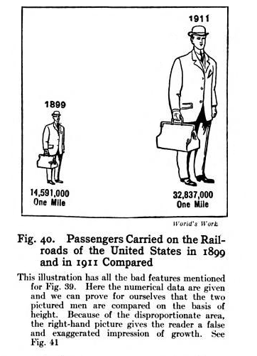
Follow @davidharrell Tweet 
|
Throughout my career at Morningstar, the Chicago-based investment research firm, I've used creative language and visual elements to explain complex investment information and ideas. This is a personal site--all opinions expressed here are my own.
Contact David Harrell personal website Links Graphic Detail EagerEyes FILWD Morningstar Magazine's Chart Tumblr Spurious Correlations Statpics Storytelling with Data Visual Complexity Recent Posts The Beautiful Game Archives June 2014 July 2014 August 2014 November 2014 February 2015 April 2015 January 2016 February 2016 March 2016 January 2017 March 2017 July 2017 |