|
OPTICAL ACUMEN At the Intersection of Data Visualization and Investment Research |
|||
|
Thursday, July 6, 2017 A Ten-Year Performance CurrentFor the 10th anniversary issue of Morningstar Magazine, I worked with designer Zach Sherwood to implement a 10-year version of my Performance Current concept that highlights the best-performing areas of the U.S. stock market over 40 quarters from 2007 to 2017: 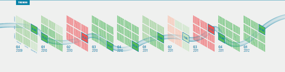
This visualization extends across five pages, so click through to the magazine to see the full article. You can also download a PDF of the entire issue. Follow @davidharrell Tweet 
Tuesday, March 14, 2017 Visualizing an Investment WatchlistI worked with Morningstar designer Pegah Ahmadi on this visualization of an investment list for the new issue of Morningstar StockInvestor. The idea was to complement the newsletter's standard data tables and allow readers to more easily spot the most undervalued names in each sector. It also permits comparisons of the sectors with each other. 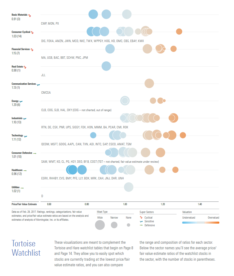
The stocks for each watchlist are presented in rows and plotted according to their price/fair value estimate ratios, with the size of each bubble reflecting each stock's economic moat rating. An interactive version, which would allow you to hover over each bubble and view additional information about the stock, would be an ideal extension of the concept. But based on positive subscriber feedback, it seems useful on paper as well. Follow @davidharrell Tweet
Monday, January 30, 2017 Clocking 2016 Investment PerformanceMy "Performance Clock" concept is now a regular feature within the Data Dashboard section in each issue of Morningstar Magazine. Here's how the clocks looked for 2016: 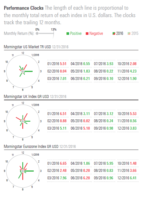
Click through to the full Data Dashboard to see the clocks for all six regions or download a PDF of the entire issue. Thanks again to Morningstar designer Zach Sherwood! Follow @davidharrell Tweet
Friday, March 18, 2016 Another Year on the ClockEarly last year, Morningstar Magazine published the first version of my Performance Clock concept. It's a way to present monthly returns using a clock metaphor, allowing easy comparisons of the monthly performance of different indexes or securities. It also allows "at a glance" assessments of overall volatility for a one-year period. For the February/March 2016 issue, we published an update, which contrasts the 2014 and 2015 performance of six Morningstar regional indexes: 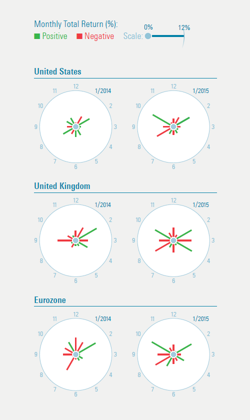
Click through to read the full article or download a PDF of the entire issue. Thanks once again to Morningstar designer Zach Sherwood! Follow @davidharrell Tweet
Wednesday, February 3, 2016 Stacking Two Market CorrectionsThe third of three "New Year's resolution" posts -- I've caught up with my other Morningstar Magazine articles in 2015! Back in 2014, I posted about the Portfolio Stack, my new concept for analyzing portfolios. It groups the holdings of a portfolio or index by investment sector, and then stacks these sector segments, with the largest on the bottom and the largest on top. Each sector can then be subdivided according to performance or valuation using a color scale. For the October/November 2015 issue of Morningstar Magazine, working with Morningstar designer Zach Sherwood, I used the visual to compare two market corrections -- the 11.01% drop in August 2015 with the 14.08% loss from August 2011. Click through to the magazine to see the full article. You can also download a PDF of the entire issue. 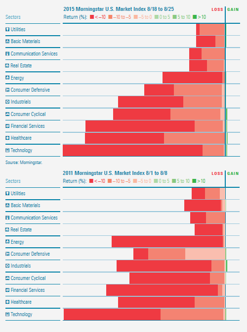
Follow @davidharrell Tweet
Wednesday, January 20, 2016 Histogram JamThis is the second of three "New Year's resolution" posts, where I play catch up with my other Morningstar Magazine articles in 2015. No designer is credited, but in early 2015 I spotted a great graphic in this Washington Post story on presidential approval ratings. It used Gallup polling data to create a series of histograms for the changing approval rates of each U.S. president going back to the Nixon administration. The beauty of the approach is that it allows for side-by-side depictions of the distributions of multiple data sets, something that's difficult to do with a traditional histogram chart. I thought the idea would be useful for investment performance and, working with designer Zach Sherwood, applied it to Ben Johnson's research on the active/passive debate in the August/September issue of Morningstar Magazine. Here you can see the distribution of under- or outperformance of passive benchmark by actively-managed mutual funds in nine different categories: 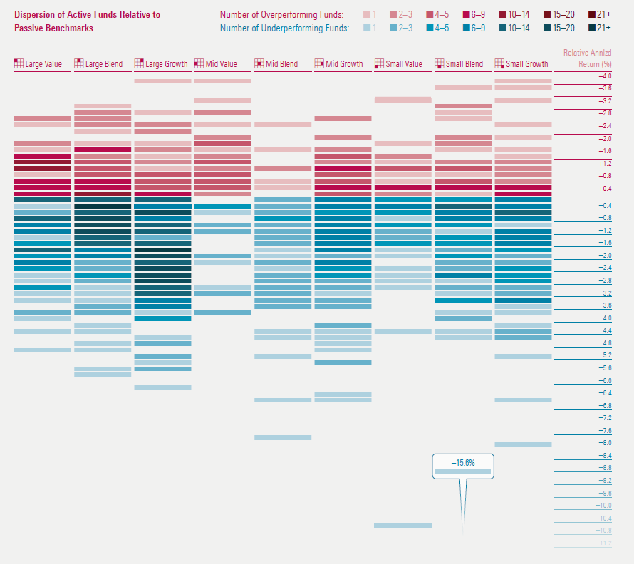
Click through to the magazine to see the full article. You can also download a PDF of the entire issue. Follow @davidharrell Tweet
Tuesday, January 19, 2016 Investment Performance CurrentsThis is the first of three "New Year's resolution" posts, where I play catch up with my other Morningstar Magazine articles in 2015. Morningstar has long used its Market Barometer to provide an investment style-based performance overview. Based on the Equity Style Box, it uses a color scale to convey the investment return of the nine segments of the market. Yet how do you use this approach to convey performance for multiple time periods? I once built an animated version of the Barometer to see performance over time, but it wasn't useful, as it's difficult to remember the colors of segment as they change. For the June/July 2015 issue of Morningstar Magazine, I worked (once again) with designer Zach Sherwood to create a display for multiple time periods, with "currents" that connected the best- and worst-performing areas of the market: 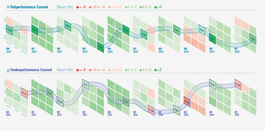
This visualization is best seen at full size, wider than this narrow blog, so please click through to the magazine to see the full article. You can also download a PDF of the entire issue. As noted in the article text, there was some persistence of outperformance from quarter to quarter. I was curious to see if there was any value to a quarterly style-momentum investment approach so I calculated the performance of a strategy based on always holding the single investment style segment that had performed best in the previous quarter. However, it returned just under 50%, which was slightly worse than holding the entire market for the entire period. Follow @davidharrell Tweet
Thursday, April 30, 2015 Mapping Investment Portfolios and IndexesBased on the tree map research of Ben Shneiderman, Martin Wattenberg introduced the Map of the Market tool on the SmartMoney website back in the late 1990s. As Wattenberg explains here, he sought to increase legibility by creating an algorithm that produced square-shaped tiles for investment sectors and the companies within each sector. As appealing as I find the visualization, little context or meaning is provided by the relative placement of investment sectors and the securities within each sector. (For example, why is sector A next to sector B?) While the colors tell a performance story of sorts -- are individual securities and sectors up or down? -- and the overall size of each sector segment conveys its weight, it can still be difficult to make meaningful comparisons of sector performance and the weight of a sector within the index. I realized that an index or portfolio map based on dedicated rows for each sector, with row height proportional to the overall weight of each sector, could address these issues. With sectors as rows, it's possible to order sectors by total market capitalization, valuation, or some other metric. And the securities within each sector can be similarly ordered. The advantages of this approach are best seen in an interactive version that allows such sorting, but we used it for a print piece in the latest issue of Morningstar Magazine. It features three versions of the portfolio of Primecap Odyssey Aggressive Growth (POAGX) with separate color scales to analyze the fund based on how long each security has been in its portfolio, valuation (as determined by the Morningstar Rating for Stocks), and recent performance of each holding. These maps are best seen at full size, wider than this narrow blog, so please click through to the magazine to view them. You can also download a PDF of the entire issue. 
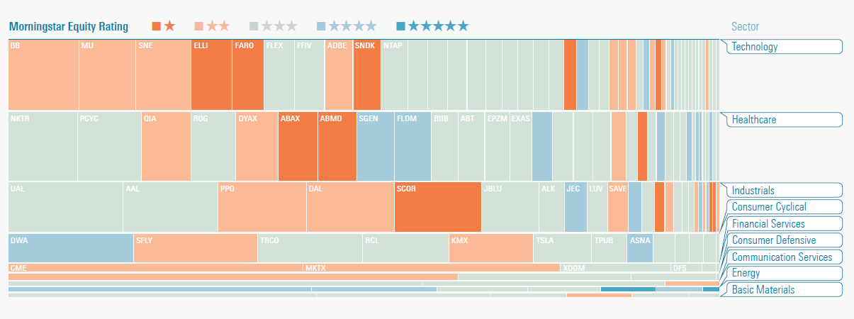

Morningstar designer Coco Liu first executed this concept and Zach Sherwood created the magazine images based on his original work. Two other Morningstar designers, Matt Jankowski and Woody Li, also contributed to the development of this visualization. I should note that this approach does have its own drawbacks, as the smallest companies within an index or portfolio appear as small vertical slivers (something that Wattenberg sought to avoid with his algorithm) and sectors with the smallest exposure appear as very short rows. The fixed row heights, combined with the minimum width of one pixel for a segment might also require a fudge factor for extremely small positions, where the space allotted for them is actually larger than their proportional weight in the portfolio. Yet I think the greater flexibility of this approach, along with the ability to more easily discern the visual weight of each sector and spot sector-based trends, is worth the trade-off. It also allows for better side-by-side comparisons of two indexes or portfolios. Follow @davidharrell Tweet
Tuesday, February 3, 2015 Clocking Investment PerformanceI have a fun little article in the February/March issue of Morningstar Magazine. It's a simple concept that takes advantage of the fact that there are 12 months in a year and 12 hours on a clock face. The monthly performance of an index or security is represented by the length of line for each hour (with January in the one o'clock position), with positive months in green and negative months in red. The shape of the each cluster makes it easy to assess the relative performance and volatility of multiple indexes or securities. Here's what the performance clocks look like (in U.S. dollars) for six of the Morningstar Global Market Indexes for 2014: 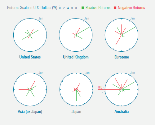
You can read the full article here or use this link to download a PDF of the entire issue of the magazine. (Kudos once again to designer Zach Sherwood for his work on the graphics.) Follow @davidharrell Tweet
Thursday, November 13, 2014 Charting an Investment Portfolio by Holding TimeThe current issue of Morningstar Magazine includes my short article on visualizing portfolio holdings, based on the amount of time held. You can see the full article here or use this link to download a PDF of the magazine issue. (Thanks once again to designer Zach Sherwood for his work on the graphic.) The portfolio turnover calculation has long been used to quantify the trading activity of a portfolio manager. But it doesn't reveal how long individual holdings have remained in a portfolio. Here's what one concentrated mutual fund (FAM Value FAMVX) looks like when the holding period for each current holding is plotted as a horizontal bar: 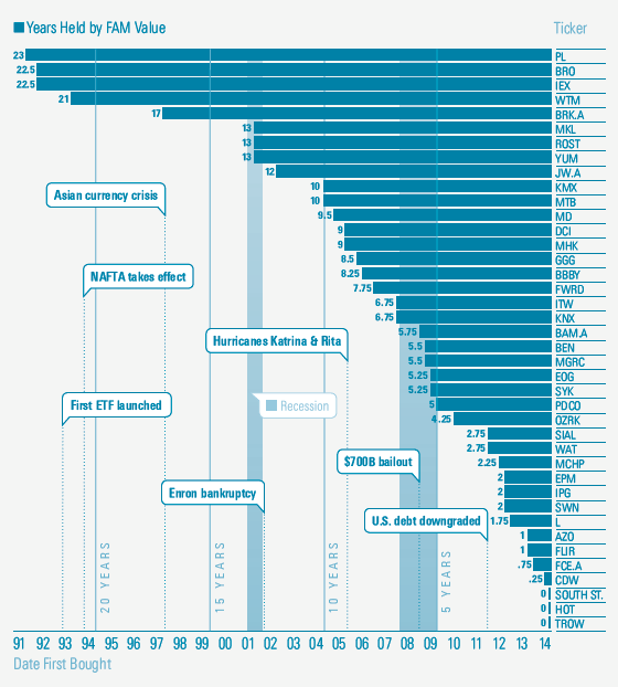
Follow @davidharrell Tweet
Sunday, August 31, 2014 Introducing the Portfolio StackThe August/September issue of Morningstar Magazine includes an article on the Portfolio Stack, my new concept for analyzing portfolios. You can see the full article here or use this link to download a PDF of the magazine issue, but this blog post provides some additional background and explanation of the concept. (Thanks to Morningstar designer Zach Sherwood for his excellent work on the article. He refined -- and improved -- my original concept sketches. The images below are from the article.) The Portfolio Stack was inspired by the classic population pyramid graphic, which has been in use since the mid-19th century. It uses horizontal rows to divide the population of a region or country into age groups, with each row split by gender to provide an instant analysis of the age and gender distribution of a population. The following example appeared in the Statistical Atlas of the United States that was created using the 1870 census data: 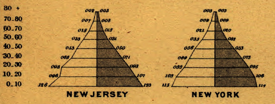
The Portfolio Stack applies the same idea to portfolios of managed investment products or indexes, with rows based on industry sectors. The width of each row is proportional to weight of the sector in the index or portfolio, with the market's largest sector (by market capitalization) on the bottom and the smallest sector on top. Hence, large sector deviations from the market become obvious and a visual metaphor of decreased stability (and correlation) relative to the market emerges. (This would work without centering the bars, but the rationale for doing so will soon be apparent.) Here's what the stack looks like for the Morningstar Broad Market Index: 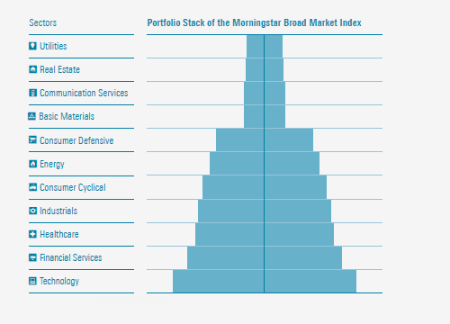
The shape of the stack for BBH Core Select BBTEX, a relatively concentrated mutual fund with no utilities or real estate holdings and minimal exposure to industrials, is quite different: 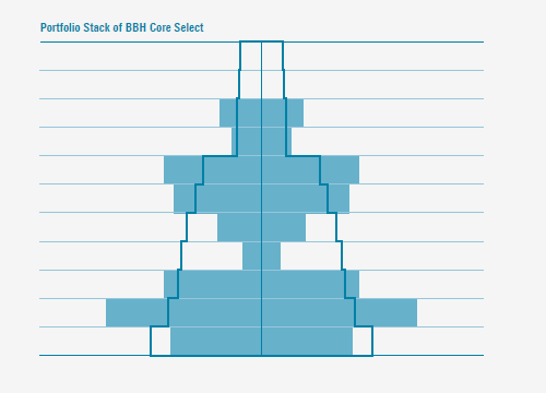
Beyond basic sector exposure, more details emerge when the sector bars are chopped into blocks, proportional to the weight of each holding within a sector. While the population pyramid uses a vertical line to divide each row by gender, a line can be used in the Portfolio Stack to divide and order each row based on the performance of each stock held in the portfolio. This performance view of the stack places stocks with negative returns on the left and those with positive returns on the right, with a color scale that reflects the magnitude of loss or gain. The result is an image that quickly reveals how the fund's picks in each sector performed relative to each other and how different stocks and sectors contributed to the portfolio's overall performance. Here's a stack based on the one-month performance of BBH Core Select: 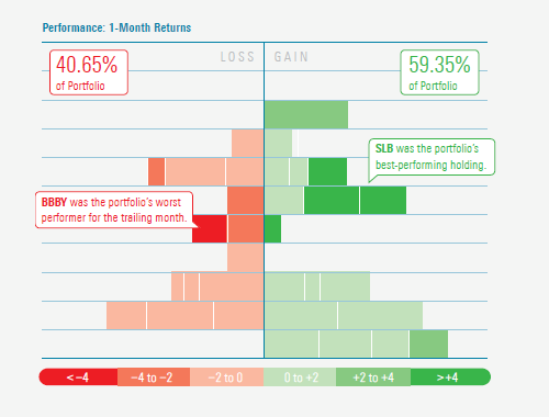
The stocks within each row can also be ordered and colored using other measures. Here's a valuation version of the stack, where the color of each company is based on its current stock price divided by a Morningstar analyst's estimate of the Fair Value of each share. Stocks with a ratio of less than 1.00 are considered undervalued, and those with a ratio of more than 1.00 are deemed overvalued: 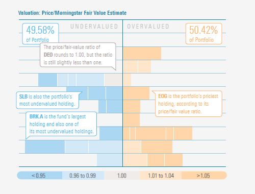
An interactive version of the Portfolio Stack, which would allow you to hover over each segment to identify the stock and view additional information, would be an ideal extension of the concept. Yet even as a static image -- or reduced to a simple outline -- the stack can still provide meaningful insight into the portfolio of an index or managed investment product. Follow @davidharrell Tweet
Wednesday, July 16, 2014 Data Visualization in 1919Readers of Edward Tufte will remember this graphic from his first book: 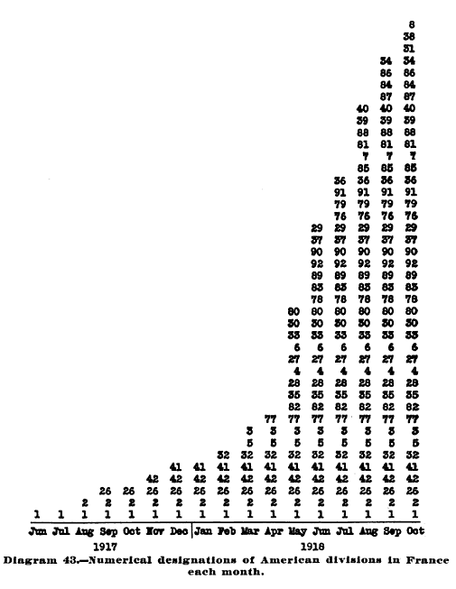
The book is filled with charts and visualizations, and while the quality of execution varies, it's amazing to see the 95-year-old work of Ayres. As Tufte observed, the book contains "several notable graphics all done by typewriter and rule." Follow @davidharrell Tweet
|
Throughout my career at Morningstar, the Chicago-based investment research firm, I've used creative language and visual elements to explain complex investment information and ideas. This is a personal site--all opinions expressed here are my own.
Contact David Harrell personal website Links Graphic Detail EagerEyes FILWD Morningstar Magazine's Chart Tumblr Spurious Correlations Statpics Storytelling with Data Visual Complexity Recent Posts A Ten-Year Performance Current Visualizing an Investment Watchlist Clocking 2016 Investment Performance Another Year on the Clock Stacking Two Market Corrections Histogram Jam Investment Performance Currents Mapping Investment Portfolios and Indexes Clocking Investment Performance Charting an Investment Portfolio by Holding Time Archives June 2014 July 2014 August 2014 November 2014 February 2015 April 2015 January 2016 February 2016 March 2016 January 2017 March 2017 July 2017 |