|
Monday, January 30, 2017
Clocking 2016 Investment Performance
My "Performance Clock" concept is now a regular feature within the Data Dashboard section in each issue of Morningstar Magazine. Here's how the clocks looked for 2016:
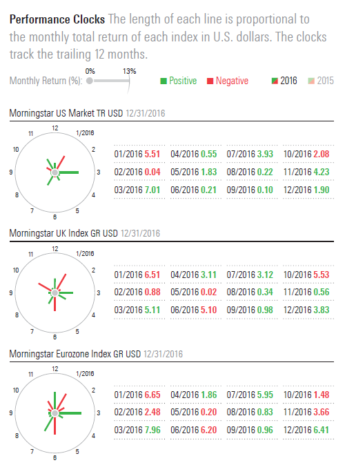
Click through to the full Data Dashboard to see the clocks for all six regions or download a PDF of the entire issue. Thanks again to Morningstar designer Zach Sherwood!

|
|
Throughout my career at Morningstar, the Chicago-based investment research firm, I've used creative language and visual elements to explain complex investment information and ideas. This is a personal site--all opinions expressed here are my own.
Contact David Harrell
Twitter
LinkedIn
personal website
Links
Graphic Detail
EagerEyes
FILWD
Morningstar Magazine's Chart Tumblr
Spurious Correlations
Statpics
Storytelling with Data
Visual Complexity
Recent Posts
A Ten-Year Performance Current
Visualizing an Investment Watchlist
Clocking 2016 Investment Performance
Another Year on the Clock
Stacking Two Market Corrections
Histogram Jam
Investment Performance Currents
Mapping Investment Portfolios and Indexes
Clocking Investment Performance
Charting an Investment Portfolio by Holding Time
Archives
June 2014
July 2014
August 2014
November 2014
February 2015
April 2015
January 2016
February 2016
March 2016
January 2017
March 2017
July 2017
|
|
