|
Thursday, July 6, 2017
A Ten-Year Performance Current
For the 10th anniversary issue of Morningstar Magazine, I worked with designer Zach Sherwood to implement a 10-year version of my Performance Current concept that highlights the best-performing areas of the U.S. stock market over 40 quarters from 2007 to 2017:
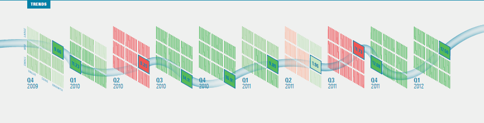
This visualization extends across five pages, so click through to the magazine to see the full article. You can also download a PDF of the entire issue.

|
|
Throughout my career at Morningstar, the Chicago-based investment research firm, I've used creative language and visual elements to explain complex investment information and ideas. This is a personal site--all opinions expressed here are my own.
Contact David Harrell
Twitter
LinkedIn
personal website
Links
Graphic Detail
EagerEyes
FILWD
Morningstar Magazine's Chart Tumblr
Spurious Correlations
Statpics
Storytelling with Data
Visual Complexity
Recent Posts
A Ten-Year Performance Current
Visualizing an Investment Watchlist
Clocking 2016 Investment Performance
Another Year on the Clock
Stacking Two Market Corrections
Histogram Jam
Investment Performance Currents
Mapping Investment Portfolios and Indexes
Clocking Investment Performance
Charting an Investment Portfolio by Holding Time
Archives
June 2014
July 2014
August 2014
November 2014
February 2015
April 2015
January 2016
February 2016
March 2016
January 2017
March 2017
July 2017
|
|
