|
OPTICAL ACUMEN At the Intersection of Data Visualization and Investment Research |
|||
|
Tuesday, February 3, 2015 Clocking Investment PerformanceI have a fun little article in the February/March issue of Morningstar Magazine. It's a simple concept that takes advantage of the fact that there are 12 months in a year and 12 hours on a clock face. The monthly performance of an index or security is represented by the length of line for each hour (with January in the one o'clock position), with positive months in green and negative months in red. The shape of the each cluster makes it easy to assess the relative performance and volatility of multiple indexes or securities. Here's what the performance clocks look like (in U.S. dollars) for six of the Morningstar Global Market Indexes for 2014: 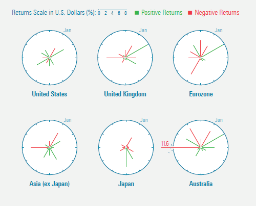
You can read the full article here or use this link to download a PDF of the entire issue of the magazine. (Kudos once again to designer Zach Sherwood for his work on the graphics.) Follow @davidharrell Tweet 
|
Throughout my career at Morningstar, the Chicago-based investment research firm, I've used creative language and visual elements to explain complex investment information and ideas. This is a personal site--all opinions expressed here are my own.
Contact David Harrell personal website Links Graphic Detail EagerEyes FILWD Morningstar Magazine's Chart Tumblr Spurious Correlations Statpics Storytelling with Data Visual Complexity Recent Posts A Ten-Year Performance Current Visualizing an Investment Watchlist Clocking 2016 Investment Performance Another Year on the Clock Stacking Two Market Corrections Histogram Jam Investment Performance Currents Mapping Investment Portfolios and Indexes Clocking Investment Performance Charting an Investment Portfolio by Holding Time Archives June 2014 July 2014 August 2014 November 2014 February 2015 April 2015 January 2016 February 2016 March 2016 January 2017 March 2017 July 2017 |