|
OPTICAL ACUMEN At the Intersection of Data Visualization and Investment Research |
|||
|
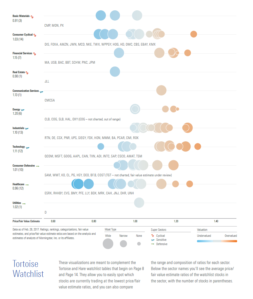
Tuesday, March 14, 2017 Visualizing an Investment WatchlistI worked with Morningstar designer Pegah Ahmadi on this visualization of an investment list for the new issue of Morningstar StockInvestor. The idea was to complement the newsletter's standard data tables and allow readers to more easily spot the most undervalued names in each sector. It also permits comparisons of the sectors with each other. 
The stocks for each watchlist are presented in rows and plotted according to their price/fair value estimate ratios, with the size of each bubble reflecting each stock's economic moat rating. An interactive version, which would allow you to hover over each bubble and view additional information about the stock, would be an ideal extension of the concept. But based on positive subscriber feedback, it seems useful on paper as well. Follow @davidharrell Tweet 
|
Throughout my career at Morningstar, the Chicago-based investment research firm, I've used creative language and visual elements to explain complex investment information and ideas. This is a personal site--all opinions expressed here are my own.
Contact David Harrell personal website Links Graphic Detail EagerEyes FILWD Morningstar Magazine's Chart Tumblr Spurious Correlations Statpics Storytelling with Data Visual Complexity Recent Posts Clocking 2016 Investment Performance Another Year on the Clock Stacking Two Market Corrections Histogram Jam Investment Performance Currents Mapping Investment Portfolios and Indexes Clocking Investment Performance Charting an Investment Portfolio by Holding Time Introducing the Portfolio Stack Data Visualization in 1919 Archives June 2014 July 2014 August 2014 November 2014 February 2015 April 2015 January 2016 February 2016 March 2016 January 2017 March 2017 July 2017 |