|
OPTICAL ACUMEN At the Intersection of Data Visualization and Investment Research |
|||
|
Thursday, April 30, 2015 Mapping Investment Portfolios and IndexesBased on the tree map research of Ben Shneiderman, Martin Wattenberg introduced the Map of the Market tool on the SmartMoney website back in the late 1990s. As Wattenberg explains here, he sought to increase legibility by creating an algorithm that produced square-shaped tiles for investment sectors and the companies within each sector. As appealing as I find the visualization, little context or meaning is provided by the relative placement of investment sectors and the securities within each sector. (For example, why is sector A next to sector B?) While the colors tell a performance story of sorts -- are individual securities and sectors up or down? -- and the overall size of each sector segment conveys its weight, it can still be difficult to make meaningful comparisons of sector performance and the weight of a sector within the index. I realized that an index or portfolio map based on dedicated rows for each sector, with row height proportional to the overall weight of each sector, could address these issues. With sectors as rows, it's possible to order sectors by total market capitalization, valuation, or some other metric. And the securities within each sector can be similarly ordered. The advantages of this approach are best seen in an interactive version that allows such sorting, but we used it for a print piece in the latest issue of Morningstar Magazine. It features three versions of the portfolio of Primecap Odyssey Aggressive Growth (POAGX) with separate color scales to analyze the fund based on how long each security has been in its portfolio, valuation (as determined by the Morningstar Rating for Stocks), and recent performance of each holding. These maps are best seen at full size, wider than this narrow blog, so please click through to the magazine to view them. You can also download a PDF of the entire issue. 
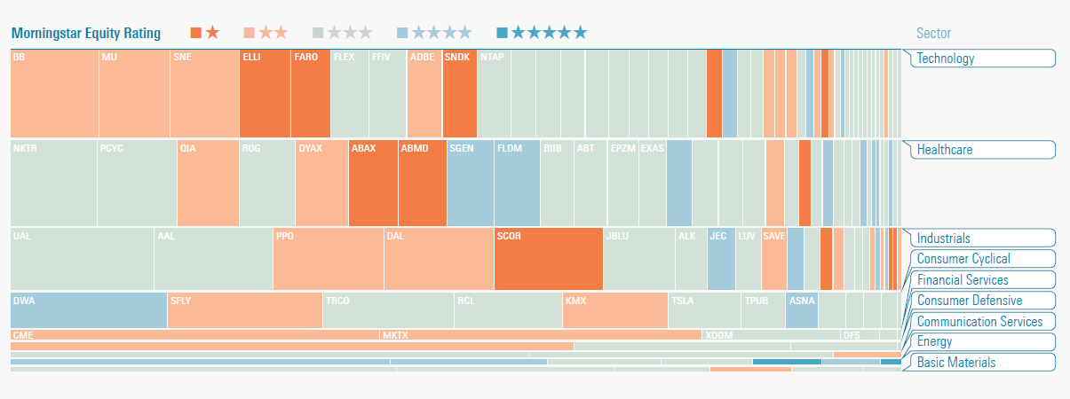

Morningstar designer Coco Liu first executed this concept and Zach Sherwood created the magazine images based on his original work. Two other Morningstar designers, Matt Jankowski and Woody Li, also contributed to the development of this visualization. I should note that this approach does have its own drawbacks, as the smallest companies within an index or portfolio appear as small vertical slivers (something that Wattenberg sought to avoid with his algorithm) and sectors with the smallest exposure appear as very short rows. The fixed row heights, combined with the minimum width of one pixel for a segment might also require a fudge factor for extremely small positions, where the space allotted for them is actually larger than their proportional weight in the portfolio. Yet I think the greater flexibility of this approach, along with the ability to more easily discern the visual weight of each sector and spot sector-based trends, is worth the trade-off. It also allows for better side-by-side comparisons of two indexes or portfolios. Follow @davidharrell Tweet 
|
Throughout my career at Morningstar, the Chicago-based investment research firm, I've used creative language and visual elements to explain complex investment information and ideas. This is a personal site--all opinions expressed here are my own.
Contact David Harrell personal website Links Graphic Detail EagerEyes FILWD Morningstar Magazine's Chart Tumblr Spurious Correlations Statpics Storytelling with Data Visual Complexity Recent Posts Clocking Investment Performance Charting an Investment Portfolio by Holding Time Introducing the Portfolio Stack Data Visualization in 1919 Style Boxing Edward Tufte...100 Years Ago The Beautiful Game Archives June 2014 July 2014 August 2014 November 2014 February 2015 April 2015 January 2016 February 2016 March 2016 January 2017 March 2017 July 2017 |