|
OPTICAL ACUMEN At the Intersection of Data Visualization and Investment Research |
|||
|
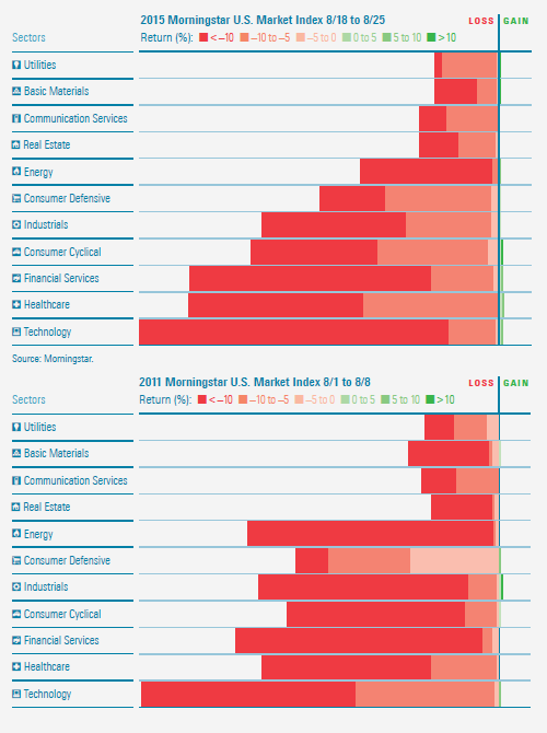
Wednesday, February 3, 2016 Stacking Two Market CorrectionsThe third of three "New Year's resolution" posts -- I've caught up with my other Morningstar Magazine articles in 2015! Back in 2014, I posted about the Portfolio Stack, my new concept for analyzing portfolios. It groups the holdings of a portfolio or index by investment sector, and then stacks these sector segments, with the largest on the bottom and the largest on top. Each sector can then be subdivided according to performance or valuation using a color scale. For the October/November 2015 issue of Morningstar Magazine, working with Morningstar designer Zach Sherwood, I used the visual to compare two market corrections -- the 11.01% drop in August 2015 with the 14.08% loss from August 2011. Click through to the magazine to see the full article. You can also download a PDF of the entire issue. 
Follow @davidharrell Tweet 
|
Throughout my career at Morningstar, the Chicago-based investment research firm, I've used creative language and visual elements to explain complex investment information and ideas. This is a personal site--all opinions expressed here are my own.
Contact David Harrell personal website Links Graphic Detail EagerEyes FILWD Morningstar Magazine's Chart Tumblr Spurious Correlations Statpics Storytelling with Data Visual Complexity Recent Posts Histogram Jam Investment Performance Currents Mapping Investment Portfolios and Indexes Clocking Investment Performance Charting an Investment Portfolio by Holding Time Introducing the Portfolio Stack Data Visualization in 1919 Style Boxing Edward Tufte...100 Years Ago The Beautiful Game Archives June 2014 July 2014 August 2014 November 2014 February 2015 April 2015 January 2016 February 2016 March 2016 January 2017 March 2017 July 2017 |