|
OPTICAL ACUMEN At the Intersection of Data Visualization and Investment Research |
|||
|
Wednesday, January 20, 2016 Histogram JamThis is the second of three "New Year's resolution" posts, where I play catch up with my other Morningstar Magazine articles in 2015. No designer is credited, but in early 2015 I spotted a great graphic in this Washington Post story on presidential approval ratings. It used Gallup polling data to create a series of histograms for the changing approval rates of each U.S. president going back to the Nixon administration. The beauty of the approach is that it allows for side-by-side depictions of the distributions of multiple data sets, something that's difficult to do with a traditional histogram chart. I thought the idea would be useful for investment performance and, working with designer Zach Sherwood, applied it to Ben Johnson's research on the active/passive debate in the August/September issue of Morningstar Magazine. Here you can see the distribution of under- or outperformance of passive benchmark by actively-managed mutual funds in nine different categories: 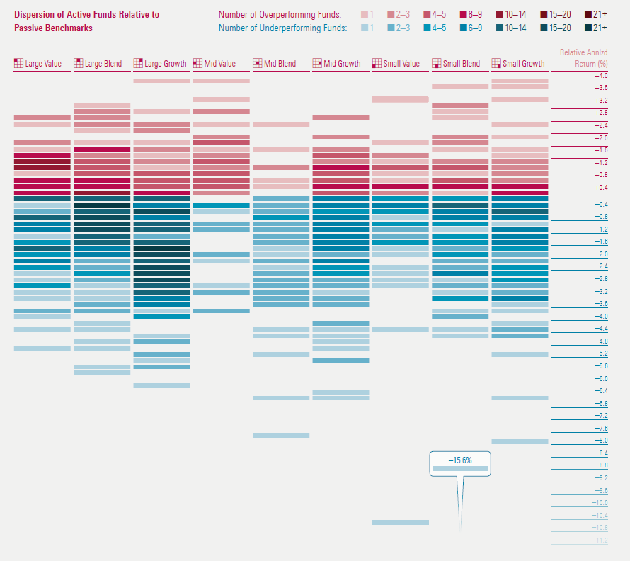
Click through to the magazine to see the full article. You can also download a PDF of the entire issue. Follow @davidharrell Tweet 
Tuesday, January 19, 2016 Investment Performance CurrentsThis is the first of three "New Year's resolution" posts, where I play catch up with my other Morningstar Magazine articles in 2015. Morningstar has long used its Market Barometer to provide an investment style-based performance overview. Based on the Equity Style Box, it uses a color scale to convey the investment return of the nine segments of the market. Yet how do you use this approach to convey performance for multiple time periods? I once built an animated version of the Barometer to see performance over time, but it wasn't useful, as it's difficult to remember the colors of segment as they change. For the June/July 2015 issue of Morningstar Magazine, I worked (once again) with designer Zach Sherwood to create a display for multiple time periods, with "currents" that connected the best- and worst-performing areas of the market: 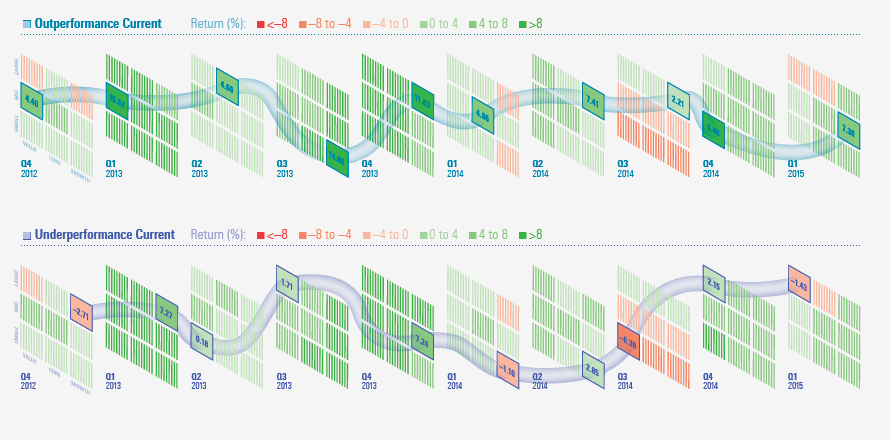
This visualization is best seen at full size, wider than this narrow blog, so please click through to the magazine to see the full article. You can also download a PDF of the entire issue. As noted in the article text, there was some persistence of outperformance from quarter to quarter. I was curious to see if there was any value to a quarterly style-momentum investment approach so I calculated the performance of a strategy based on always holding the single investment style segment that had performed best in the previous quarter. However, it returned just under 50%, which was slightly worse than holding the entire market for the entire period. Follow @davidharrell Tweet
|
Throughout my career at Morningstar, the Chicago-based investment research firm, I've used creative language and visual elements to explain complex investment information and ideas. This is a personal site--all opinions expressed here are my own.
Contact David Harrell personal website Links Graphic Detail EagerEyes FILWD Morningstar Magazine's Chart Tumblr Spurious Correlations Statpics Storytelling with Data Visual Complexity Recent Posts A Ten-Year Performance Current Visualizing an Investment Watchlist Clocking 2016 Investment Performance Another Year on the Clock Stacking Two Market Corrections Histogram Jam Investment Performance Currents Mapping Investment Portfolios and Indexes Clocking Investment Performance Charting an Investment Portfolio by Holding Time Archives June 2014 July 2014 August 2014 November 2014 February 2015 April 2015 January 2016 February 2016 March 2016 January 2017 March 2017 July 2017 |